
BOEHRINGER INGELHEIM
Visual Identity and Toolkit for e-learning program
CLIENT
Boehringer Ingelheim
ROLE
Senior UI Designer
AGENCY
Else London
OVERVIEW
Boehringer Ingelheim is a global, family-owned pharmaceutical company operating in over 100 countries. They sought help in developing an on-demand learning program to boost employees' digital savviness and drive digital transformation within the organization.
As the lead designer, I was responsible for creating the visual identity of the program, ensuring it effectively represented the various learning paths while being easily recognizable. From there, I developed a comprehensive toolkit of visual assets to support and promote the program. These assets included promotional banners, digital award badges, certificates, PowerPoint templates, desktop backgrounds, and more, all designed to maintain consistency and engagement across all touchpoints.
KEY SKILLS
Concepting, Visual Design, Toolkit, Presentation Templates
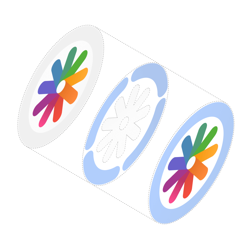
THE COMPASS
This deconstructed Compass ident demonstrates the 2 distinct types of learning within the program.

TOOLKIT
PROMOTIONAL BANNERS
To generate internal awareness of the program a line of banners were created in various formats. Formats included: Leaderboards, MPUs, Email banners, Facebook posts, and MS Teams banners.

MODULE SPECIFIC BANNERS
Micro Modules and Workshops were made visually distinct to add clarity to communications.
MICRO MODULES


LIVE WORKSHOPS


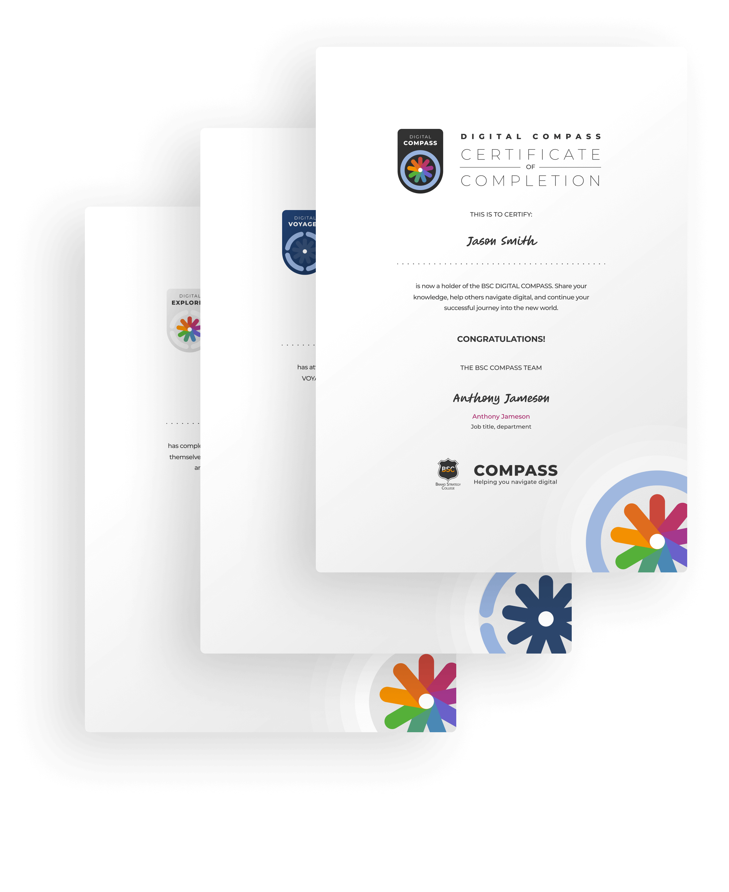
AWARDS
As employees progress through the program, they earn different awards that can be showcased across their communications. For each level completed, participants receive a digital certificate, badge, and a custom Zoom background, recognizing their achievements
FLEXIBILE SOLUTION
As is often the case with creative projects, when production began, some of the modules were still not fully defined. Therefore, everything had to be designed with a level of flexibility to accommodate potential changes to the program.
FIGMA/ADOBE
From the outset, the intention was to produce the toolkit in Figma. However, as the project progressed, it became clear that certain territories required an Adobe-friendly alternative. To accommodate this, an Adobe Illustrator version was created.
OUTCOME
The consistent design language made the enrollment process clear, compelling and helped create an engaging and supportive learning environment, encouraging employees to complete the program.
This set of complementary icons were created specifically for workhop landing pages.
© Untold Digital Ltd 2024